Believe it or not, there is such a thing as too much help. Unfortunately, too much help often isn’t helpful at all.
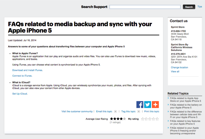
For example, take a look at the design of this iPhone 5 FAQ page from Sprint:

What’s wrong with this FAQ page design example?
- No focus. You don’t know where to look first, second, or even third.
- Tiny text. The FAQ text is so small that the eye is drawn to the Contact Us box to the right.
- Superfluous sections. The Related Topics is off to the side and doesn’t sit in a white box like the other sections. It feels like it’s not supposed to be there, but it is anyway.
- Long, redundant titles. There’s no good reason to awkwardly start a title with “FAQs related to.” A better title would mirror your customers’ own language, with something like “How do I backup my iPhone 5?”
Plus, the biggest offender of all: The FAQ doesn’t explain how to backup or sync with your iPhone 5!
Generally, not much thought goes into the design of a support journey. Just like the one above, help centers often overload customers with information all at once. They’re designed as if to say, “You want help? We’ll give you help.”
It doesn’t have to be this way. I’m going to take you through five rules I’ve learned from building FAQs over the years.
Rule #1: FAQs should be short and limited
I managed a support center that yielded some interesting results when we started recording clicks and interactions. From these results we realized we had two options for the beginning of the FAQ, one yielding much better results than the other.
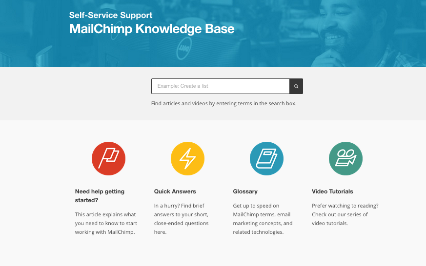
1. When we had a very prominent search box plus a few select links beneath it (like the Mailchimp example below), search went way up. The design led users to instinctively search for their question first before clicking the FAQs.
2. When a page had an equally prominent search box and a long list of FAQs (15+ lines), there was a significant drop in search box usage. Customers clicked around on the FAQs first.
Option 1 allowed customers to see top issues first and then use the search for the questions instead of browsing and yielding more relevant results.
Option 2 had the FAQs dominating the page, forcing the customers to browse 15+ questions. After all that reading, they simply felt exhausted and would look for another channel for an answer.
The lesson is to put a spotlight on one or the other. Simple design will always win and retain the customer. As with MailChimp’s design above, the search box is backed up with robust content, while offering different types of self-service for speedy, high-level browsing.
With Mailchimp’s central search box, you know where to start looking for answers.
Rule #2: FAQs will give you false positives
What else is wrong with a long, distracting FAQ? They throw off your analytics.
This has been the case with every FAQ I have managed. Customers read the whole list of FAQs as they are looking for their topic, get curious and click on articles that may not apply to their question. A critical message for an issue that affects a small sample of the user base is tempting to click and can make data mountains from mole hills. When you go back and look at your analytics, you’ll find yourself puzzling over false trends for your weekly analytics report.
In general, it’s best to not use your FAQs as a place to put your freshest articles. Let the searches determine what customers are looking for and use the FAQ to serve those selected solutions faster.
Rule #3: FAQs have to be routinely maintained
If it were up to me, FAQs would be tweaked almost daily in order to be consistently relevant for customers’ search trends.
Unfortunately, support teams are often at the mercy of the web team, which won’t always put updating support pages high on their priority list. This makes updating FAQs a clunky, time-consuming task.
Instead, use your weekly data for a Friday adjustment so that your FAQs are refreshed with prioritized content for the weekend. (For more on this, check out our post on what goes into a help center base audit.) Picking up this habit will help quell weekend requests so agents can have a less stressful Monday.
Rule #4: Trending FAQs are not a good thing
Service leaders have told me before that they’d love to have their support pages automatically display their newest and most popular articles. These are called “dynamic FAQs”. Basically, your FAQs are automatically populated and ordered by how recent or popular they are. It makes sense at first glance: Why bother sorting manually when you could just have a system do it for you?
Because dynamic FAQs aren’t what they are cracked up to be. Once an article reaches the top, it tends to stay at the top. That is, these articles tend to feed back into the list, creating another route for the false positives I mentioned in Rule #2.
Manual editing is time consuming, but the control you keep over your FAQs is well worth it. As mentioned in Rule #3, developing a weekly habit for refreshing your FAQs based on customer searches will help quit a bit.
Rule #5: Your search box is your most powerful asset
If the great search engine wars of the late 90’s and early 00’s taught us anything, it’s that people just want a magic box that pulls up answers to their questions.

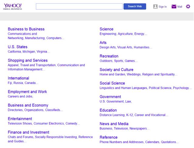
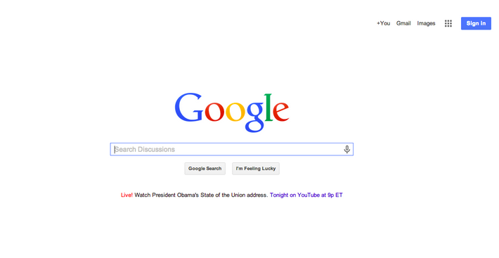
Yahoo! was once king of the hill with its directory service where browsing and ‘discovering’ was thought the best way to find information. Once Google came along with its powerful search engine, you couldn’t pay people to go back to a directory. It’s clear to see that simplicity wins – people just want a magic search box.

People just want to type their query into a box and get relevant results. Who knew?
A big fear for support people is empty search results, but there are a couple of ways to prevent this.
First, invest the time to make your content easier to find! If you have a lot of support content, the knowledge manager can use titles, tags and keywords (plus their synonyms) to improve relevance and searchability. If you have limited content, well-curated lists and subsections can do the trick.
Second, you may have outgrown your search or content platform. Check with your web team to see if the existing search tool can be tweaked or enhanced. If not, then you might want to look into an out of the box solution search utility or think about changing your support’s content and search platform to something more scalable.
The final word
Customers love it when they can get what they were looking for and move on with their lives.
Design for the utter lack of patience that customers have these days. Believe me, doing the hard work to build a more intuitive and readable FAQ starts to pay off immediately. You’ll find that your team has to take on fewer of those repetitive support inquiries, giving them time to work on bigger issues with customers that really need it.

