Explore 25 of the best FAQ page design examples to improve user experience, reduce support queries, and boost conversions with smart, intuitive layouts.
Your FAQ page is doing one of two things right now: deflecting tickets and building trust, or silently sending frustrated customers straight to your inbox.
Most FAQ page designs fall into a depressingly predictable pattern: a wall of accordion dropdowns, 47 questions nobody actually asked, and a footer link so buried it may as well not exist. But a handful of companies have cracked the code. Their FAQ pages don’t just answer questions , they anticipate them, guide users through complex problems, and even convert browsers into buyers.
I went deep on 25 companies whose FAQ and help center designs genuinely stand out. I went beyond the usual suspects and dug into what makes each one mechanically, structurally, and psychologically excellent. Here’s what I found, and more importantly, what your CS team can implement tomorrow.
|
What Separates a Great FAQ Page Design from a Generic One
Before we dive into the 25, here’s the framework I used to evaluate these pages. The best FAQ designs consistently nail five dimensions:
- Speed to Answer: Users find answers in under 30 seconds without asking for help.
- Accessibility: The page works beautifully on mobile, with keyboard navigation, and for screen readers.
- Question Authenticity: Questions reflect what real customers actually ask, pulled from ticket data, not what marketing thinks they ask.
- Brand Cohesion: The design doesn’t fight the brand. It reinforces it.
- Conversion Architecture: The FAQ doesn’t just inform , it nudges users toward the right next action.
Keep this rubric in mind as you read. The best pages score high across all five.
The 25 Best FAQ Page Designs: Ranked and Explained
1. Stripe

Why It Stands Out: Developer-grade precision meets human clarity.
Stripe’s support center is built like its API: clean, fast, and eerily intuitive. The homepage surfaces four high-priority “hot topics” at the top (dynamic, updated based on current incidents or product changes), a powerful search bar that handles natural language, and a sidebar that filters by product area. What’s brilliant is that Stripe surfaces contextual FAQs based on what you’re currently doing in the dashboard. If you just created a payout, the help widget shows payout-related articles , not a generic homepage. The writing is technical but never condescending, with code snippets embedded directly into answers for developers.
What CS Teams Can Learn: Context-aware help is the future. If your product has multiple features or user personas, stop showing everyone the same FAQ. Surface relevant content based on what the user just did or where they are in the journey. Stripe proves that a “smart” FAQ dramatically reduces contact volume on complex products.
💡 Pro Tip: Audit your support tickets by page/feature and create FAQ clusters for each. Surface those clusters contextually, either via in-app banners or a smart widget that triggers on specific user actions.
2. Figma
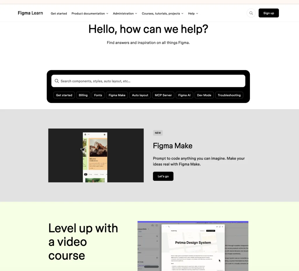
Why It Stands Out: Color as wayfinding: a masterclass in visual organisation.
Figma’s help center is exactly what you’d expect from a design tool company: exceptionally designed. The page uses color-coded blocks to separate beginner guides, advanced tutorials, video content, and release notes , each with its own visual identity. Search suggestions appear below the search bar in real time, surfacing the six most commonly typed phrases. There’s a “What’s New” banner at the top (updated with each product release) that proactively answers “why did my tool just change?” The community forum is woven directly into help results, so users see both official answers and peer solutions in one view.
What CS Teams Can Learn: Use visual hierarchy as a navigation tool. Color, icons, and card-based layouts aren’t just decoration , they help users self-sort into the right content category without reading everything. Figma also models the “proactive FAQ” perfectly: when they ship a new feature, they put the FAQ for that feature front and center before users even know they need it.
💡 Pro Tip: Map your FAQ categories to your product’s actual feature areas, not abstract concepts like “Billing” and “Technical.” Figma uses task-based language (“Designing in Figma,” “Sharing & Collaboration”) that maps to what users are trying to do, not just what the product does.
|
3. Notion
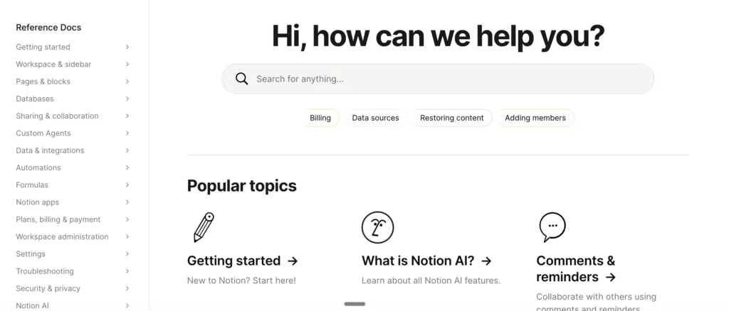
Why It Stands Out: Progressive disclosure done right, for users with wildly different needs.
Notion serves an impossibly broad user base: solo students, 10-person startups, and Fortune 500 enterprises. Their FAQ/help center solves this with four distinct entry points based on user type , “For Teams,” “For Personal Use,” “For Students,” and role-specific paths. Each path shows different top questions and featured guides. The writing mirrors Notion’s brand personality: warm, slightly irreverent, and encouraging. Help articles don’t just answer questions , they include embedded Notion templates so users can immediately apply what they’ve learned. The search is fast and handles synonyms well (search “database” and you also get “table” results).
What CS Teams Can Learn: Segment your FAQ by user persona, not just by topic. A small business owner asking “how do I set up billing?” needs a different answer than an enterprise admin asking the same question. Persona-filtered FAQs dramatically improve resolution rates and reduce follow-up tickets.
💡 Pro Tip: If you serve multiple customer segments, add a persona selector to your FAQ homepage. Even a simple “I am a…” dropdown can route users to content 60-70% more relevant to their situation.
4. Intercom
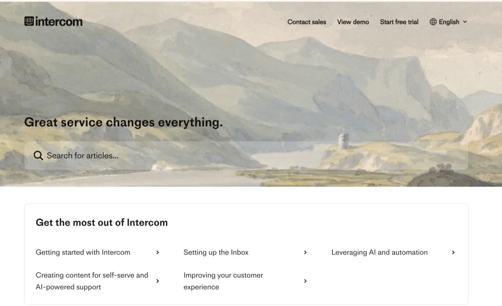
Why It Stands Out: The meta-FAQ: a customer support tool with an exceptional customer support page.
There’s a delicious irony in Intercom: a company that sells support tools, having one of the best-designed help centers on the web. Their page is structured around use cases (“Setting up your inbox,” “Building your chatbot”) rather than features, which is a fundamental shift in FAQ philosophy. The search results are layered: first showing a direct AI-generated answer, then linking to the full article, then showing related community posts. Answer quality is exceptionally high because Intercom actively mines their support chat logs to identify gaps and updates articles within 48 hours of a new FAQ trending. They also show “Last updated” timestamps on every article , a tiny trust signal that matters enormously.
What CS Teams Can Learn: Date-stamp your content. Users abandon outdated FAQs because they don’t trust stale information, especially in fast-moving industries. An article from 2019 about pricing might actively harm your brand. Intercom shows that freshness signals (last updated dates) are a powerful retention tool on FAQ pages.
💡 Pro Tip: Schedule a quarterly “FAQ decay review” where you identify articles older than 6 months and verify they’re still accurate. Add “Last updated” dates to every article. Customers notice , and trust you more for it.
5. Airbnb
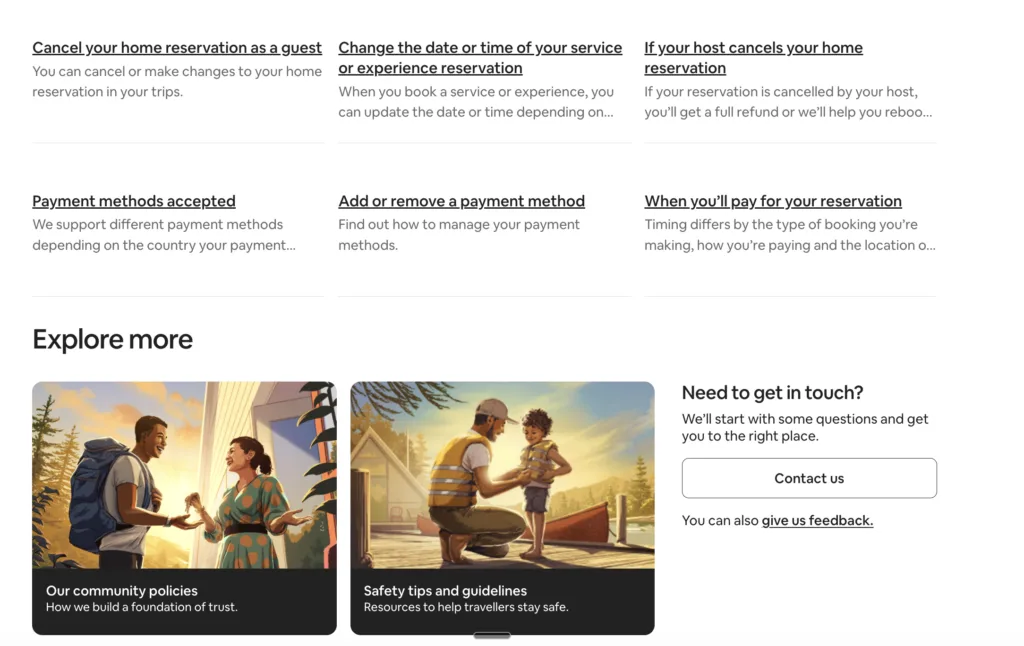
Why It Stands Out: Two audiences, one elegant page: the dual-role FAQ done perfectly.
Airbnb serves two fundamentally different customers: hosts and guests. Their solves this brilliantly with a prominent switcher at the very top: “I’m a Guest” / “I’m a Host.” The entire page reorganizes on selection, with different questions, different tone, and different CTAs. Guest FAQs are warm and reassuring (“What if my host cancels?”). Host FAQs are practical and empowering (“How do I set smart pricing?”). Search is context-aware , if you’re logged in as a host, the default search context is host-related. There’s also an “AirCover” FAQ section with a visual explainer (not just text) that breaks down their insurance coverage in a way that builds genuine trust before a dispute arises.
What CS Teams Can Learn: If your product or service has multiple user types, your single FAQ is probably failing at least one of them. A dual-audience FAQ, with clear persona switching , reduces “this doesn’t apply to me” abandonment and cuts contacts from confused users who got the wrong answer.
💡 Pro Tip: Audit your last 200 support tickets. How many came from the wrong user type getting generic FAQ answers? If it’s more than 20%, you need audience segmentation on your FAQ immediately.
|
6. Apple
Why It Stands Out: Product-specific routing that gets users to answers in one click.
Apple’s support page opens with a visual product selector: an icon grid of iPhone, iPad, Mac, Apple Watch, etc. This single design decision eliminates the most common FAQ failure mode: users landing on a generic page and having to self-diagnose which category their question belongs to. The page restructures completely when you select a product. Apple also runs a “Top articles this week” section updated daily, which surfaces FAQ content driven by real-time trends (a new iOS update drops, those articles jump to the top automatically). Their repair and service page integrates FAQ directly with scheduling , so the answer to “my screen cracked” ends with a “Book a Genius Bar appointment” CTA, not a dead-end.
What CS Teams Can Learn: Close the loop in your FAQ answers. Don’t just answer the question. Answer it and then tell the user exactly what to do next. Apple integrates action-oriented CTAs (book a repair, check your warranty, contact us) at the bottom of every relevant FAQ. This is the difference between a passive knowledge base and an active support funnel.
💡 Pro Tip: Review your 20 most-viewed FAQ articles and add a specific “What to do next” section at the bottom of each one. This single change typically reduces follow-up contacts by 15-25%.
7. Slack
🔗 slack.com/help
Why It Stands Out: The in-context FAQ: support that lives where work happens.
Slack’s most impressive FAQ design decision isn’t on their website , it’s inside the app. The “?” icon surfaces a help widget that’s aware of which Slack surface you’re currently on (channels, DMs, Workflow Builder) and shows context-relevant articles. Their website help center uses a category structure based on user behavior flows (“Getting started,” “Messaging,” “Workflow Builder”) not arbitrary feature groupings. The search engine is exceptional, handling typos and partial matches gracefully. One underrated feature: Slack shows “Popular in [your workspace size]” , so a 5-person startup sees different top questions than an enterprise admin, even before they search.
What CS Teams Can Learn: Build your FAQ around workflows, not features. Slack doesn’t have a “slash commands FAQ”. They have it embedded in the “Sending Messages” workflow guide. Users think in tasks (“I’m trying to do X”), not features (“I want to know about Y feature”). Structure your FAQ the same way.
💡 Pro Tip: Pull your top 30 support tickets from the last quarter and group them by user goal (“I’m trying to set up billing,” “I’m trying to onboard a new user”) rather than product area. This user-goal mapping is the right structure for a modern FAQ.
8. HubSpot
Why It Stands Out: The knowledge base as brand ambassador: 500,000 monthly visitors can’t be wrong.
HubSpot’s knowledge base is arguably the most trafficked FAQ/help center in B2B SaaS. The search is so powerful that users consistently say they prefer it to Google for HubSpot questions. The page architecture uses a “popular topics” section updated weekly from real search data. Every article includes a “Was this helpful?” rating (yes/no), and articles below 60% helpful get flagged for human review and rewrite within 30 days. HubSpot also indexes their FAQ pages aggressively for SEO , many of their help articles rank #1 on Google for relevant queries, meaning the FAQ is also a major inbound acquisition channel.
What CS Teams Can Learn: Your FAQ is an SEO asset. HubSpot earns hundreds of thousands of visits monthly because their FAQ answers the questions their prospects Google. Structure your FAQ answers in a way that’s optimized for both users and search engines , clear headings, direct answers in the first sentence, structured data markup.
💡 Pro Tip: Do a keyword gap analysis comparing what your prospects search vs. what’s covered in your FAQ. Every gap is both a support ticket waiting to happen and an SEO opportunity you’re leaving on the table.
9. Shopify
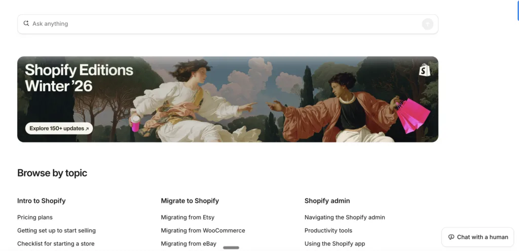
Why It Stands Out: Tiered complexity: beginner to advanced in the same page.
Shopify sells to first-time store owners and 7-figure merchants simultaneously. Their FAQ architecture handles this through a “Learning path” system embedded in their help center. Beginners see simplified question cards. Advanced users can toggle to “Developer docs” with one click. What’s remarkable: the same URL serves both audiences through progressive disclosure , simple answers surface first, with expandable “Advanced configuration” sections below. Shopify also runs real-time “What’s trending” FAQ sections updated when there’s a platform issue, payment processing outage, or major feature launch , keeping users informed proactively instead of reactively.
What CS Teams Can Learn: Design for the full spectrum of user sophistication. A simple answer is useless for a power user; an advanced answer is terrifying for a beginner. Use progressive disclosure (show the simple answer first, reveal complexity on demand) to serve both audiences with a single piece of content.
💡 Pro Tip: Audit your most-viewed FAQ articles and identify where “beginner abandonment” happens (users who land on an advanced article via search and immediately bounce). Add a “Just getting started? Here’s the simple version” section at the top of those articles.
10. Zendesk
Why It Stands Out: Community + official docs = the layered answer model.
Zendesk’s support page brilliantly layers three types of content for every query: official documentation, community forum answers, and AI-generated summaries. When you search a question, you see a box at the top with an AI answer sourced from multiple articles, then “Official articles” below, then “Community posts” below that. The community integration is particularly powerful , Zendesk’s forum has millions of posts, and the most helpful peer answers appear directly in search results. This layered model means users get the verified official answer AND real-world implementation advice from practitioners who’ve solved the same problem.
What CS Teams Can Learn: Don’t silo your FAQ from your community. If you have a user forum, customer community, or even a public Slack/Discord, surface relevant peer discussions alongside official FAQ content. Users trust peer answers for “how do I actually implement this” questions almost as much as they trust official docs.
💡 Pro Tip: If you don’t have a customer community, start one. Even a simple forum or Slack community generates peer-to-peer FAQ content that reduces your official documentation burden while building customer loyalty.
11. Duolingo
Why It Stands Out: Brand personality at full volume, even in the help center.
Duolingo’s FAQ page design is unmistakably Duolingo. Duo the owl appears in the header with contextual expressions (confused when users land on an error page, happy on the homepage). The writing is conversational and slightly cheeky , “Did you forget your streak? Here’s how to fix it (it happens to the best of us).” The structure is rigorously logical despite the playful tone: questions are grouped by in-app journey stage (onboarding, streaks, subscriptions, learning). The search handles natural language questions like “why did I lose my streak” returning exact matches, not keyword soup. Crucially, the FAQ’s tone is consistent with the app , which means users never feel like they’ve left the product experience.
What CS Teams Can Learn: Your FAQ is part of your product experience. If your product has a distinct personality, it should live in your FAQ too. Generic, corporate FAQ language creates a jarring disconnect for users of consumer-oriented products. Duolingo proves that helpful and entertaining aren’t mutually exclusive.
💡 Pro Tip: Rewrite your three most-visited FAQ articles in your brand’s actual voice. A/B test the original vs. the personality-led version. Most companies find that engagement (time on page, helpful ratings) increases 20-40% when FAQ tone matches product tone.
|
12. Canva
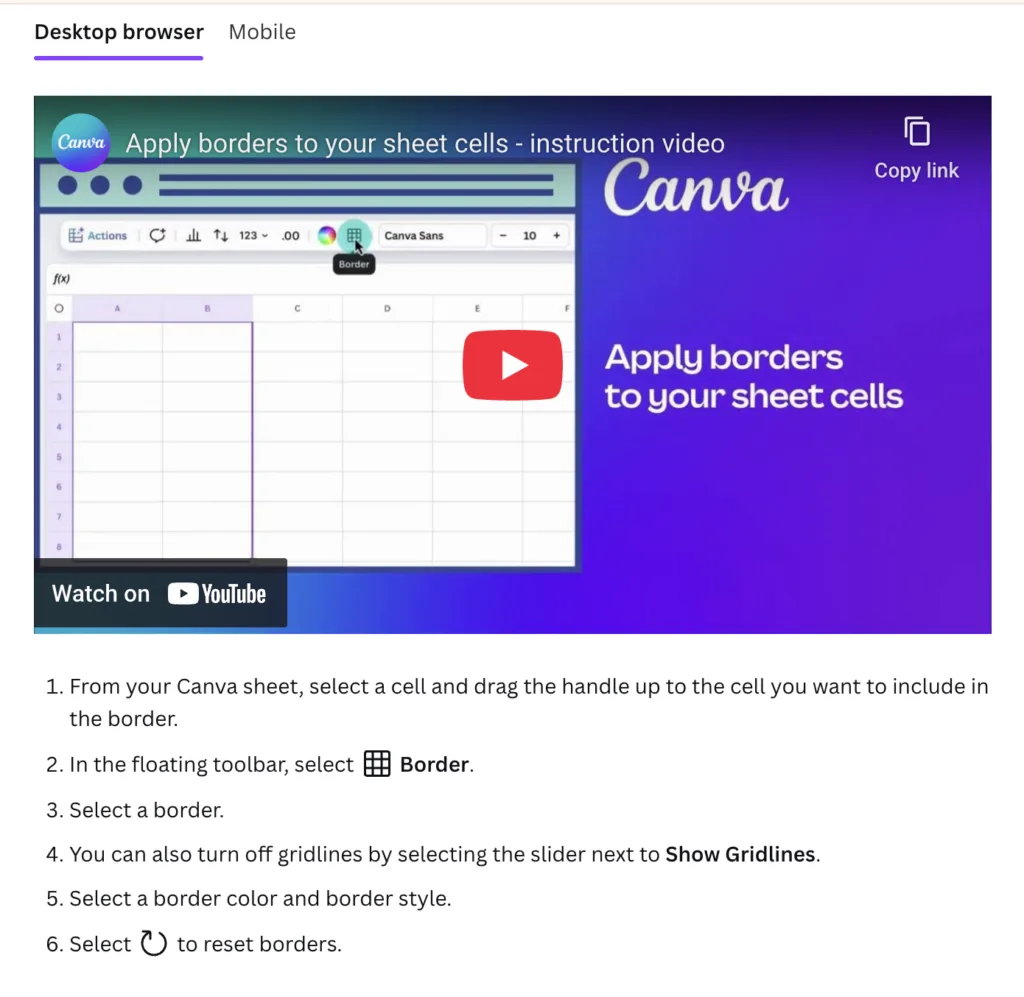
Why It Stands Out: Visual-first answers for a visual-first product.
Every FAQ answer on Canva’s help center includes at least one annotated screenshot. Complex workflows include step-by-step GIFs. For visual learners (which, given Canva’s audience, is most of their users), this is transformative , the answer to “how do I resize my design?” includes a GIF showing exactly which button to click, not just text describing it. The help center also runs a “trending designs” banner at the top during peak periods (Valentines Day FAQ for holiday cards surfaces weeks before Feb 14). The structure is feature-based but uses Canva’s own templates to present categories visually , the FAQ page design itself looks like a well-designed Canva creation.
What CS Teams Can Learn: Match your answer format to your product type. If you sell a visual product, text-only FAQ answers work against you. Canva’s use of screenshots and GIFs isn’t just nice-to-have , it’s essential for their audience. For complex products, a 30-second screen recording answers questions that would take 500 words of text.
💡 Pro Tip: Identify your top 10 “how do I do X” FAQ articles and add a short screen recording or annotated screenshot to each. Track helpful ratings before and after. Most teams see a 30-50% improvement in “Yes, this was helpful” clicks.
13. Spotify
Why It Stands Out: Mood-aware FAQ that adapts to the user’s platform and situation.
Spotify’s support center detects what device and OS you’re on and automatically surfaces device-specific troubleshooting. “Why won’t Spotify play offline?” returns different answers for iPhone users vs. Android users vs. desktop users , without you needing to select your device. The FAQ also has a “known issues” status bar at the top (distinct from a status page) that briefly lists current outages or bugs affecting many users. This single feature eliminates thousands of daily tickets , when users see “We’re aware of offline playback issues on iOS 18 and working on a fix,” they stop submitting tickets. The “Community” tab is deeply integrated, surfacing Spotify Community answers alongside official docs.
What CS Teams Can Learn: Device and platform detection is a support superpower. If your product behaves differently across platforms (web, mobile, desktop, different OS versions), building that detection into your FAQ saves enormous manual effort for both users and agents. Users shouldn’t have to tell you what device they’re on.
💡 Pro Tip: Look at your support tickets and identify the top five “platform-specific” FAQ questions. Build conditional content that shows platform-relevant answers automatically based on user agent detection or a simple device selector.
14. Dropbox
Why It Stands Out: Three pillars, zero confusion: structural simplicity at its finest.
Dropbox’s help center opens with three sections: “Product guides” (how to use Dropbox), “Popular articles” (updated daily from search data), and “Top community posts” (peer solutions). That’s it. No overwhelming category grid. No 47 dropdown options. The minimalism is strategic: Dropbox has research showing that users who see more than 6 categories on a help homepage show increased abandonment. Their search is exceptional, returning results in under 200ms. What’s quietly brilliant: the “Popular articles” section auto-updates with live data, so when a Dropbox update causes a spike in “how do I access my old files” questions, that article surfaces to the top within hours , without human intervention.
What CS Teams Can Learn: Fewer categories almost always mean better FAQ performance. Counterintuitively, limiting your homepage to 3-5 categories forces you to make harder prioritization decisions , and results in users finding answers faster. If you have 20 FAQ categories, you almost certainly have 15 too many.
💡 Pro Tip: Run a click-heat map on your FAQ homepage. Identify which categories get less than 5% of clicks and either consolidate them into larger categories or move them to secondary navigation. Reduce your top-level categories to 5 or fewer and test the impact on search rate and abandonment.
15. Adobe
Why It Stands Out: Product-ecosystem navigation done at enterprise scale.
Adobe sells 50+ products. Their FAQ challenge is unique: how do you build a help center that serves Photoshop beginners, Premiere Pro editors, and Acrobat enterprise admins simultaneously without overwhelming anyone? Their solution: a product selector as the literal front page of their help center, with products organized by category (Creative Cloud, Document Cloud, Experience Cloud). The help experience is tailored completely per product, with different top questions, different visual design, different community. Adobe also runs product-specific forums directly within each help center, so Lightroom questions never pollute Illustrator threads.
What CS Teams Can Learn: Product-first navigation (as opposed to topic-first navigation) dramatically reduces time-to-answer for companies with complex product portfolios. If your customers regularly express confusion about which product/plan/tier a question applies to, front-load that disambiguation in your FAQ.
💡 Pro Tip: If you offer more than three distinct products or plans, test a “What are you trying to do?” selector on your FAQ homepage instead of a topic grid. This single change helped multiple SaaS companies reduce average time-to-answer from 4 minutes to under 90 seconds.
16. Mailchimp
Why It Stands Out: Empathy in writing , the FAQ page that reads like a conversation.
Mailchimp’s FAQ content team has a distinctive voice: warm, practical, slightly self-deprecating. Their guides don’t say “Navigate to the Settings panel and select the Automation workflow configuration module.” They say “Click the gear icon (it’s in the top right), then find Automations , it’s probably the third option down.” This conversational precision , acknowledging user frustration before explaining the solution , creates unusually high “helpful” ratings. What’s less visible but equally powerful: Mailchimp tracks “rage clicks” on their FAQ pages (rapid repeated clicking on something that isn’t working) and flags those areas for content review within 24 hours.
What CS Teams Can Learn: Write FAQ answers for the frustrated user, not the calm one. Mailchimp’s team asks “how would a patient friend explain this?” before writing any FAQ answer. The result is content that acknowledges struggle (“This can be confusing , here’s the simplest way to think about it”) before jumping to the solution.
💡 Pro Tip: Take your three lowest-rated FAQ articles and rewrite them using this framework: (1) Acknowledge the confusion. (2) Give the fastest possible answer first. (3) Explain why in plain language. (4) Add a visual if complexity warrants it. Compare helpful ratings before and after.
17. Loom
Why It Stands Out: Video answers from a video company , obvious in hindsight and rare in practice.
Loom is a video messaging product, so it’s almost poetic that their best FAQ answers are short Loom videos. Most help center pages are text with optional images. Loom flips this: the default answer format is a 60-90 second screen recording, with text as the supplementary option. For complex workflow questions (“how do I set up my team workspace?”) there’s a full 3-minute walkthrough video embedded directly in the article , not linked out to YouTube, embedded with chapter markers. Users can jump to the specific part of the setup they’re stuck on. Their in-app FAQ is a lightweight overlay (7 categories max) that links out to the full help center, maintaining focus rather than trying to contain everything in-product.
What CS Teams Can Learn: Use the same communication format in your FAQ that your product champions. A video company should answer with video. A writing tool should answer with well-crafted prose. A data platform should answer with examples and screenshots. Format consistency between product and FAQ reinforces brand trust.
💡 Pro Tip: Survey your users on whether they prefer text, video, or visual walkthroughs for complex FAQ topics. Most products find that 40-60% of users prefer video for “how do I do X” questions. That’s a major opportunity if you’re still text-only.
|
18. Linear
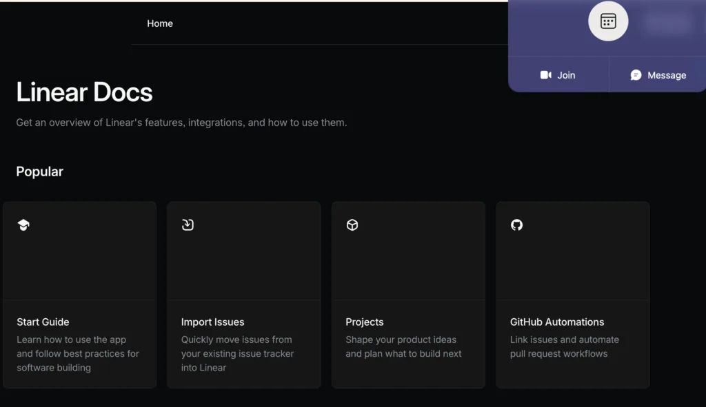
Why It Stands Out: The speed-obsessed FAQ for a speed-obsessed product.
Linear is famous for its keyboard-first, ultra-fast UX, and their FAQ/docs page embodies the same philosophy. Search is instant (results appear as you type, no submit required). Keyboard shortcuts work throughout the docs (press “K” to open command palette, navigate between articles with arrow keys). The docs structure mirrors how developers think: not “Getting Started” → “Features” → “Troubleshooting” but instead “Concepts” → “How-tos” → “API Reference.” Linear also links generously between related docs, creating a web of context rather than isolated Q&A. Page load time is under 200ms. For a product whose core promise is “fast,” the FAQ reinforcing that speed promise is a subtle but powerful experience alignment.
What CS Teams Can Learn: Your FAQ should embody your product’s core promise. Linear promises speed. Their FAQ is fast. Notion promises flexibility , their FAQ is flexible and non-prescriptive. Canva promises beautiful simplicity , their FAQ is visually beautiful. The best FAQ page designs are micro-experiences of the brand promise itself.
💡 Pro Tip: Write down your product’s core promise in one sentence. Then audit your FAQ: does every design decision, including load speed, navigation, content format, tone , reinforce that promise? Where it doesn’t, you have a brand-experience gap worth fixing.
19. Rippling
Why It Stands Out: Role-based FAQ that knows who you are before you ask.
Rippling serves HR admins, IT managers, and employees from the same platform, serving three audiences with almost zero FAQ overlap. Their support center detects your role from your login and shows a completely different FAQ homepage to each persona. An HR admin sees questions about payroll runs, compliance, and benefits enrollment. An employee sees questions about their pay stub, PTO balance, and equipment requests. This role-detection means users never see irrelevant questions. Search is also scoped by default to your role, though you can expand it. The result: Rippling’s support team reports that role-based FAQ routing reduced misdirected tickets (HR admin questions sent to employee support) by over 40%.
What CS Teams Can Learn: If your platform has distinct user roles (admin vs. end user, buyer vs. supplier, manager vs. IC), role-aware FAQ routing should be near the top of your roadmap. The ticket reduction from “misdirected question” elimination alone typically pays for the development cost in months.
💡 Pro Tip: Map your last 100 support tickets by user role. If more than 15% of tickets are role-mismatches (a user asking a question that belongs in a different persona’s FAQ), you’ve identified a specific fix with a measurable ROI.
20. GitHub
Why It Stands Out: Community-powered FAQ at the intersection of documentation and Stack Overflow.
GitHub’s docs are famous in the developer world for a specific reason: they’re community-contributed. Any developer can submit a PR to fix or improve a docs article. This model means thousands of practitioners are effectively QA-ing the FAQ in real time. What makes the design exceptional: each article has a “Feedback” section at the bottom where users can rate the article and leave specific suggestions (not just thumbs up/down, but “the answer was correct but hard to find” vs. “the answer didn’t solve my problem”). GitHub uses this feedback data to prioritize documentation rewrites. The result is a living FAQ that improves continuously rather than going stale.
What CS Teams Can Learn: Build a structured feedback loop into every FAQ article. Thumbs up/down is a start, but “what specifically was wrong with this answer?” generates actionable improvement data. GitHub’s granular feedback system identifies fixable problems rather than just flagging that something’s wrong.
💡 Pro Tip: Add a multi-option feedback widget to your FAQ articles: “This solved my problem” / “This was hard to find” / “The answer was incomplete” / “The answer was wrong.” The three failure modes are very different and require different fixes. Knowing which one you have is the first step.
|
21. Basecamp
Why It Stands Out: Radically minimal, radically opinionated, and it works.
Basecamp is a company that has strong opinions about software and design. Their FAQ reflects this: it’s one of the most stripped-down help centers of any major SaaS product, with zero visual decoration and pure functional content. What it lacks in visual flair it more than compensates for with writing quality. Every FAQ answer is written by a Basecamp employee and reads like it was written by someone who genuinely uses the product and knows exactly what confuses users. The guides include subtle editorial opinions (“We recommend this approach because…”) that go beyond just answering the question to actually advising users on best practices. This opinionated voice reduces ambiguity and builds enormous trust.
What CS Teams Can Learn: Don’t confuse visual complexity with helpfulness. Basecamp proves that a minimal, well-written FAQ can outperform a visually elaborate one. If you have to choose between great design and great writing , choose great writing. Users came for the answer, not the aesthetic.
💡 Pro Tip: Pull your last 10 1-star FAQ ratings and read the user comments. I’ll bet most aren’t complaining about design. They’re complaining about content quality. Writing quality is the highest-leverage improvement most FAQ teams can make.
22. Square
Why It Stands Out: Integrating FAQ with live status: the proactive support model.
Square serves small business owners who depend on payment processing for their livelihood. A payment outage is existential for these users , so Square’s FAQ page integrates a live system status feed directly in the header. Before you even search, you know whether Square is experiencing any incidents. This reduces “is it down?” tickets dramatically. Their FAQ structure is organised around business type (restaurant, retail, services, online), and search is scoped by default to your registered business type. Each FAQ answer includes a “Time to implement” tag (“~5 minutes” or “~30 minutes with IT assistance”) , a small design detail that reduces drop-off on complex setup guides.
What CS Teams Can Learn: Proactive status communication belongs on your FAQ, not just on a separate status page. Most users don’t know your status page exists , but they do check your FAQ when something seems wrong. Adding a live status indicator to your FAQ homepage can eliminate 20-30% of “is this a bug?” tickets during incidents.
💡 Pro Tip: Integrate your status page data into your FAQ homepage with a simple green/yellow/red indicator. When you’re having an incident, your FAQ traffic spikes , that’s the exact moment users need proactive communication most.
23. Monday.com
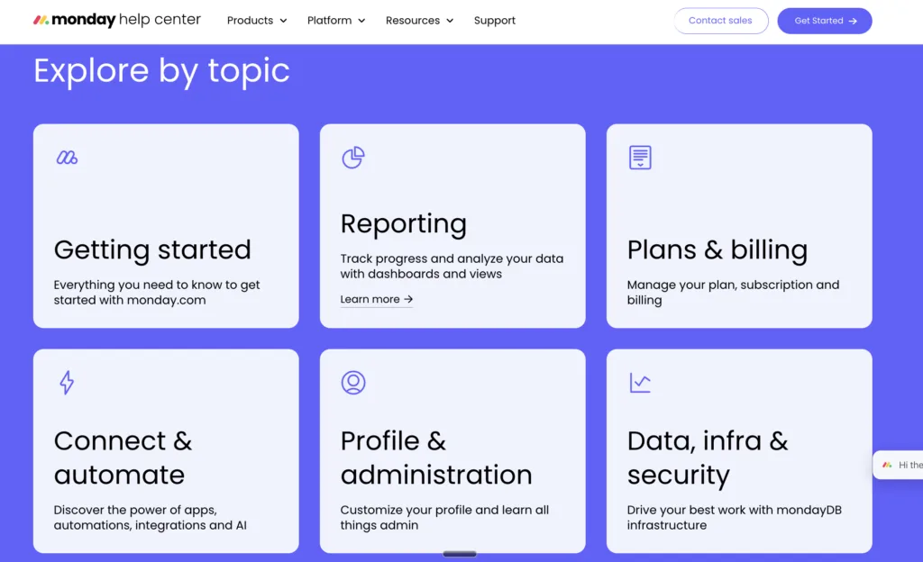
Why It Stands Out: The tutorial-first FAQ , teaching over answering.
Monday.com made a deliberate strategic choice: their help center is a learning center first, FAQ second. The homepage features “Monday.com Academy” front and center , structured video courses with certificates , before showing individual FAQ articles. This reflects an insight their support data revealed: most of their support tickets weren’t questions with single answers, they were knowledge gaps requiring broader understanding. By leading with learning paths instead of FAQ search, Monday.com shifted users from reactive help-seeking (I’m broken) to proactive skill-building (I want to get better). Their FAQ articles are shorter and simpler as a result , pointing to Academy content for complex topics rather than trying to explain everything in text.
What CS Teams Can Learn: Rethink whether your support problem is a FAQ problem or a knowledge gap problem. If the same users contact support repeatedly about the same topic area, the issue isn’t that they can’t find your FAQ , it’s that a single FAQ answer isn’t enough. Tutorial-led support (video courses, structured learning paths) solves the problem that FAQ can’t.
💡 Pro Tip: Identify your top five “repeat contact” FAQ categories , the topics that generate the most follow-up tickets even after users have read the FAQ. For each one, ask: “Does this need a better answer, or does it need a better learning experience?” The answer will tell you whether to write or to film.
|
24. Wise (formerly TransferWise)
Why It Stands Out: Trust-building FAQ for a high-anxiety product category.
Money transfers are inherently anxiety-inducing because users are trusting a company they might have just discovered with significant sums. Wise’s FAQ page design is engineered to neutralise this anxiety at every turn. Every FAQ answer about fees ends with a real-time fee calculator embedded inline , no need to navigate away to check the cost of a transfer. Security FAQs include third-party audit credentials and regulatory license numbers. The “How long will my transfer take?” FAQ shows real live data (average transfer times from the last 1,000 transfers for each corridor) rather than generic estimates. This data transparency is radical , and it eliminates a massive category of uncertainty-driven support contacts.
What CS Teams Can Learn: In high-trust industries (finance, healthcare, legal, compliance), your FAQ needs to do more than answer questions. It needs to resolve anxiety. Wise earns trust not through reassurance but through transparency: real numbers, real data, real regulatory context. Use your FAQ to make the invisible visible.
💡 Pro Tip: Identify the three questions that generate the most anxiety-driven tickets (usually about money, security, data, or timing). For each one, ask: “What data or proof could I add to this answer that would reduce follow-up contact?” Data > reassurance, every time.
25. Kayako
Why It Stands Out: AI-powered FAQ that learns and improves itself.
We’ve saved the most forward-looking example for last. Kayako’s own help center embodies the same AI-first philosophy it sells to customers. The knowledge base learns from every ticket resolution , when an agent resolves a ticket, the system identifies whether an existing FAQ article could have deflected it, and flags that article for review. When no article exists, it drafts one using the resolved ticket as source material. The result: a FAQ that gets better with every support interaction rather than gradually going stale. Search understands conversational intent (“why did my payment fail” returns articles about failed transactions, not just exact keyword matches). The AI Answers layer provides instant responses sourced from multiple knowledge base articles, with confidence scoring , so users know whether the AI is certain or whether they should escalate to a human.
What CS Teams Can Learn: The future of FAQ design isn’t just better information architecture , it’s intelligent content that self-improves. The companies that will win on self-service in 2025 and beyond are building FAQs that learn from their own failures. Every unresolved ticket is feedback about a FAQ gap. The question is whether your system captures that feedback automatically or lets it evaporate.
💡 Pro Tip: Map your support resolution workflow and identify the exact moment when FAQ improvement could be triggered automatically. Even a simple “did this ticket reveal a FAQ gap?” checkbox in your agent interface , linked to your knowledge base , creates a feedback loop that compounds over time.
5 Master Patterns Every CS Team Should Steal
1. Context-Awareness Beats Generic Search
The best FAQ pages , Stripe, Rippling, HubSpot , don’t show everyone the same content. They use login state, role, device, and behavior signals to surface relevant content before users have to ask. If you’re building or rebuilding a FAQ, invest in contextual personalisation before adding more content.
2. Freshness Signals Build Disproportionate Trust
Intercom’s “last updated” timestamps and GitHub’s community-contribution model both solve the same problem: users don’t trust stale content. In fast-moving industries, a FAQ article from two years ago can actively harm you. Build freshness checks into your editorial calendar.
3. The Best FAQ Answers End With an Action
Apple closes every FAQ with a specific next step. Square embeds real-time calculators. Shopify links to learning paths. Your FAQ isn’t finished when it answers the question , it’s finished when it tells the user what to do next. Closing this loop is the single highest-ROI FAQ improvement most teams can make.
4. Format Should Match Product Personality
Loom uses video. Figma uses color. Linear uses speed. Duolingo uses personality. The FAQ pages that generate the highest “helpful” ratings are the ones that feel like natural extensions of the product experience , not generic corporate information pages. Audit your FAQ’s format against your brand promise.
5. Audience Segmentation Is Non-Negotiable at Scale
Airbnb, Adobe, Rippling, and Notion all prove the same thing: a single FAQ for multiple audiences is actually a worse FAQ for every audience. The companies that win at self-service are the ones who’ve done the work to build persona-aware content paths.
Build a FAQ That Actually Deflects Tickets
The companies above didn’t build great FAQ pages by accident. They built them by treating FAQ as a product, with user research, data feedback loops, and continuous improvement cycles. The gap between a FAQ that generates tickets and one that deflects them isn’t about content volume. It’s about design intelligence.
Kayako’s AI-powered knowledge base gives your team the same feedback loops, auto-improvement infrastructure, and contextual delivery that the best support teams in the world rely on , without needing a team of 50 to maintain it.
| See how Kayako’s AI knowledge base deflects 68% of tickets before they hit your queue. Real deployments. Real results. |
SEO Meta Title: 25 Best FAQ Page Designs: What CS Teams Can Learn (2025)
SEO Meta Description: We analysed 25 companies with the best FAQ page designs, from Stripe to Duolingo to Airbnb , and extracted the exact lessons customer support teams can steal to reduce tickets and delight users.
Focus Keyword: best FAQ page design | Secondary: FAQ page examples, help center design, customer support self-service