|
A knowledge base is often the first place a customer turns and the last thing a company invests in. That is a mistake, because good knowledge base design quietly resolves thousands of issues before they ever become tickets, while a poorly designed one sends frustrated people straight to your support queue. The difference is rarely the underlying content. It is the design: how findable, scannable, and trustworthy that content is.
The fastest way to build a great help center is to study the ones that already work. This guide breaks down ten knowledge base design examples worth learning from, the specific thing each does well, and the design patterns that repeat across all of them. It closes with the mistakes even great help centers fall into, and how to keep your own on the right side of them.
What makes a knowledge base design great?
Before the examples, it helps to name what you are looking for. Customers overwhelmingly want to help themselves. Higher Logic’s widely cited research found that 92% of consumers would use an online knowledge base if one were available (via Pylon), and Harvard Business Review reporting found that 81% of customers try to resolve an issue on their own before contacting support (via Delight). Great design is what decides whether those attempts succeed.
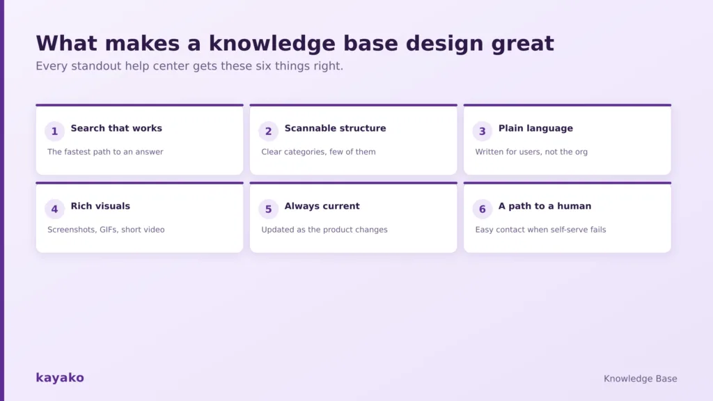
Every standout help center gets these six things right.
Six traits show up in nearly every excellent help center: search that surfaces the right answer instantly, a category structure you can scan in seconds, plain language written for users rather than the org chart, visuals that show instead of tell, content kept current as the product changes, and an obvious path to a human when self-service falls short. A strong customer self-service strategy ties these together. With those traits in mind, the examples below each show one done exceptionally well.
|
10 knowledge base design examples to learn from
These help centers come from companies that ship product changes constantly and have invested heavily in documentation. Each one is worth a visit, and each offers a specific pattern you can adapt.
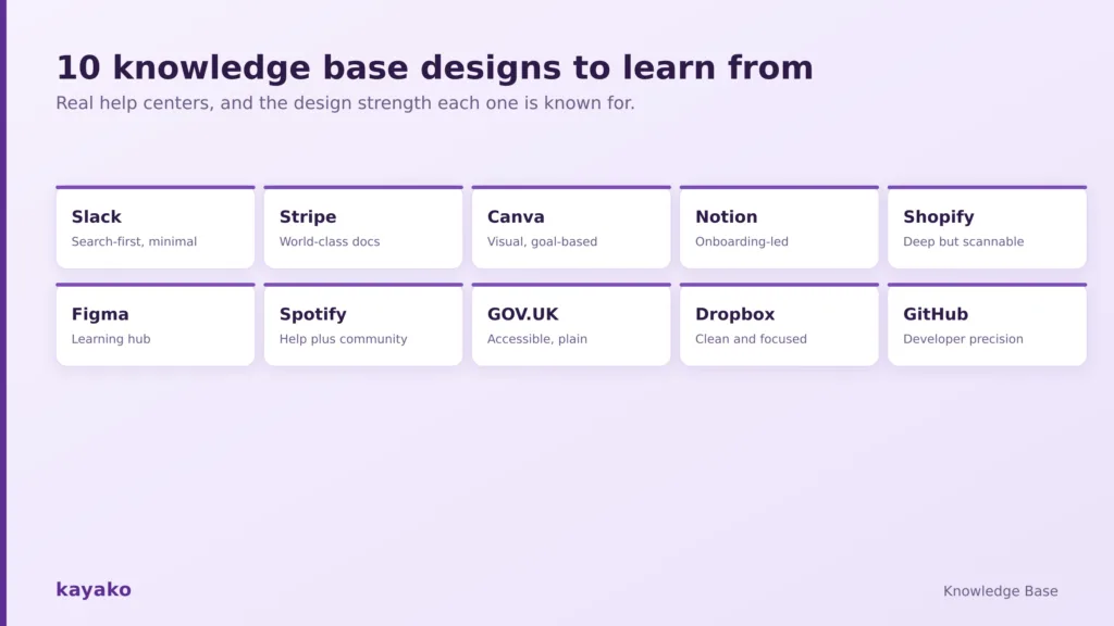
Ten real help centers, and the design strength each one is known for.
1. Slack: search-first minimalism
Slack’s help center leads with a prominent “Find anything” search bar and keeps its categories deliberately few. It surfaces popular topics right away and runs a separate Slack Tips section that doubles as onboarding. The takeaway: when in doubt, cut categories and make search the hero of the page.
2. Stripe: documentation as a product
Stripe famously has some of the best documentation on the internet. It cleanly separates its support site, for account and billing, from its docs site, for technical implementation, and fills the latter with working code samples and interactive explorers. The takeaway: match the format to the reader, and treat docs as a product, not an afterthought.
3. Canva: visual-first and goal-based
Canva’s help center leans heavily on GIFs, screenshots, and short video, which fits a design product perfectly. Crucially, its articles are organized around user goals like “How do I create a presentation?” rather than feature names. The takeaway: title and structure content the way customers search, not the way your product is built.
4. Notion: onboarding built into help
Notion’s help center reads like a guided introduction to a flexible product, helping newcomers grasp what the tool can do rather than only fixing problems. The takeaway: for products people have to learn, blend help content with onboarding so the knowledge base teaches as well as troubleshoots.
5. Shopify: comprehensive without overwhelming
Shopify’s help center is enormous, yet it stays scannable. Articles walk merchants through tasks end to end, with context-aware links that anticipate the next step, and the content is localized for a global audience. The takeaway: depth and simplicity can coexist if you structure by task and guide people to what comes next.
6. Figma: a learning hub, not just a help desk
Figma’s help center pairs traditional support articles with structured learning paths, so users can either fix a problem or build a skill. The takeaway: separating “help me now” content from “teach me” content lets each do its job without cluttering the other.
7. Spotify: help plus community
Spotify’s support site combines concise help articles with an active community forum, so answers come from both the company and other users. The takeaway: a well-run community can extend your knowledge base and cover the long tail of questions you will never write articles for.
8. GOV.UK: accessibility and plain language
The GOV.UK site has to serve an entire nation, including non-native speakers, older people, and users with disabilities, and its award-winning design hides complexity behind ruthlessly plain language. Its team put it well: you should not have to understand how government works to interact with it. The takeaway: if a government can make bureaucracy this accessible, your product can do the same.
9. Dropbox: clean and task-focused
Dropbox’s help center is a study in restraint: a clear search bar, a handful of obvious categories, and short articles focused on the specific task at hand. The takeaway: for a broad consumer audience, simplicity and focus beat comprehensiveness every time.
10. GitHub Docs: developer-grade precision
GitHub’s documentation is built for a technical audience and shows it, with precise, versioned, thoroughly cross-linked content. The takeaway: know your audience’s tolerance for detail, and give a technical reader the depth and accuracy they expect rather than dumbing it down.
|
Read across these ten and a shared blueprint emerges. It is worth looking at that common layout directly.
The anatomy of a great help center page
Strip these examples down, and most of them share the same homepage structure. It is a template you can borrow wholesale.
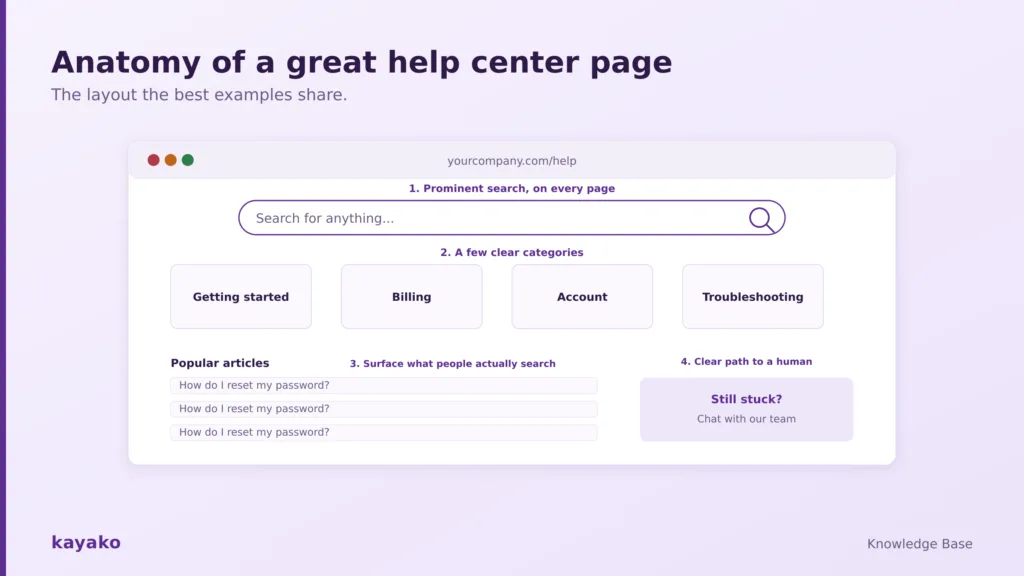
The layout the best examples share, from search bar to a clear path to a human.
A prominent search bar sits at the top of every page, because search is how most people prefer to find answers. Below it, a small set of clear categories lets browsers orient themselves without feeling lost. Popular or recently updated articles are surfaced directly, so common questions are answered in one click. And a visible contact option waits for the moment self-service runs out, so no one hits a dead end. Keep that skeleton, and the underlying knowledge base structure beneath it, and you are most of the way to a good design.
Knowledge base design patterns worth stealing
Beyond the homepage, a handful of patterns recur across the best examples. Treat this as a checklist for your own help center.
- Write titles as customers search. Use goal-based, plain-language titles like “How do I cancel my plan?” rather than feature labels. Match the words people actually type.
- Show, do not just tell. Use screenshots, annotated images, GIFs, and short videos. Different people learn differently, and visuals cut reading time. Our guide to knowledge base formats covers when to use each.
- Keep articles scannable. Break text with headings, short paragraphs, bullets, and white space so a reader can jump straight to the part they need.
- Separate FAQs from deep guides. Quick answers and step-by-step walkthroughs serve different needs. A strong FAQ page design complements longer articles rather than replacing them.
- Add trust signals. A visible system status link, last-updated dates, and article feedback all tell customers the content is alive and reliable.
| Give every article a consistent, on-brand design, with Kayako |
Knowing the patterns to copy is only half the picture. It helps just as much to know what to avoid.
Common knowledge base design mistakes
Even the twelve best help centers in the world share one weakness, and it is worth naming so you can guard against it.
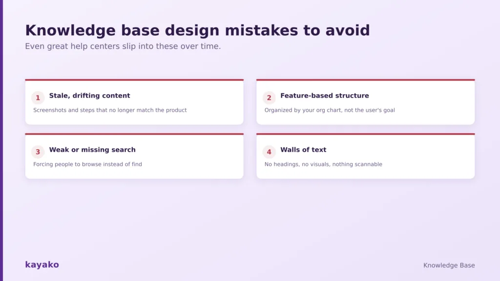
Even great help centers slip into these design mistakes over time.
- Invisible drift. The most common flaw is stale content: a screenshot of a redesigned screen, a step that references a moved menu, a price that changed months ago. It never shows up from the homepage, but every visitor hits it.
- Feature-based structure. Organizing content by your internal product areas instead of the customer’s goal forces people to know your system before they can find help.
- Weak search. If search does not surface the right article, the rest of the design barely matters, because most people search before they browse.
- Walls of text. Long, unbroken articles with no visuals or headings are hard to scan and quickly abandoned.
- No path to a human. A help center that traps customers with no visible way to reach support turns a small problem into a frustrated one.
Avoiding these is less about design talent and more about the systems that keep a help center current and findable, which is where the right platform earns its place.
| Catch stale articles before your customers do, with Kayako analytics |
How to design and run a help center like these with Kayako
You can copy the patterns from Slack, Stripe, or Canva, but you cannot download their underlying systems. What makes those patterns sustainable is tooling that keeps content findable, current, and connected to real support. That is what Kayako provides.
Kayako’s knowledge base gives you a branded, fully searchable help center that matches the anatomy above out of the box, with prominent search, clean structure, and a built-in path to a human. Its analytics show which articles get used, which searches fail, and where content gaps sit, so you can fix drift before customers feel it. And its AI agent, Agent Kay, reads your knowledge base to answer customers directly and can flag the articles that need updating, turning a static library into an active one. For more on that, see how to scale support with a smarter knowledge base and where AI is taking customer service. Great design gets customers to the right article. The right platform makes sure that article is still true.
| Turn your knowledge base into an active, AI-powered help center with Kayako |
The best knowledge base designs are not the flashiest. They are the ones that get a customer to a correct, current answer with the least friction, through strong search, scannable structure, plain language, and useful visuals. The ten examples here each show one of those strengths, and the anatomy and patterns they share give you a template to start from today. The hard part is not the initial design. It is keeping the content true as your product changes, so choose tooling that makes that upkeep easy and follow proven knowledge base best practices, and your help center will keep earning its place as your best support agent.
Frequently asked questions
What is a knowledge base design?
Knowledge base design is how a self-service help center is structured, laid out, and written so customers can find and trust answers on their own. It covers search, navigation, and categories, article formatting, visuals, and the overall look and feel. Good design is measured by how quickly a customer finds a correct answer, not by how the pages look.
What are some good knowledge base design examples?
Frequently cited examples include Slack for search-first minimalism, Stripe for developer documentation, Canva for visual and goal-based content, Shopify for depth that stays scannable, and GOV.UK for accessibility and plain language. Each demonstrates a specific design strength worth studying and adapting to your own product and audience.
How do I design a knowledge base?
Start from customer goals rather than your product structure, put a prominent search bar on every page, and use a small set of clear categories. Write plain-language, goal-based article titles, break content with headings and visuals, and always include a way to contact support. Then measure which articles and searches work, and refine continuously.
What makes a knowledge base easy to use?
Fast, accurate search is the single biggest factor, since most people search before they browse. After that, a scannable structure, plain language, visuals that show steps, current content, and an obvious path to a human all reduce friction. Ease of use comes from removing every small obstacle between a question and its answer.
How many categories should a knowledge base have?
Fewer than you think. The best examples keep top-level categories to a handful, often five to eight, so users can scan them at a glance. Too many categories create decision paralysis and hide content. It is usually better to have a few broad, well-labeled categories with strong search than a long list of narrow ones.