“Contact us” forms usually fall down by the wayside when it comes to web design. Why?
Because there’s a common misconception that contact forms are an outdated method of communication, that nobody ever really uses them anymore, and that it’s virtually impossible to screw up a simple form design anyway.
All of these statements are myths.
Even though the technology exists to make customer service easier and more accessible (customer support software, live chat widgets, etc), that doesn’t mean that older users (a demographic that is increasing) will use them.
Besides that, should a visitor of any age encounter an issue while using your website or app, it’s more likely that they’ll reach out using the contact form if it’s the first method they discover (because users are lazy!).
Let’s take a look at 3 ways to build the best contact form!
Keep it (very) short
Even if you’re not a designer, you do have the ability to think like one. The best designers are those that use their empathy to see through the user’s eyes — to feel the user’s frustration when an app or website isn’t working as expected, and then come up with a viable solution.
Put yourself in the shoes of the user for a second. If you had to fill out a form, would you prefer to complete 6 input fields, or 3? Three, of course.
The more steps the user has to take, the worse the user experience. Putting hurdles in front of the user, and forcing them to hop over, is bad user experience.
If you’re finding it difficult to explain why you need to collect the information, you could probably do without it.
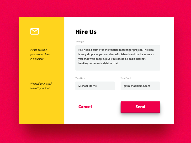
Image: visualrocks.co
Remember, if a visitor is using your website’s contact form, they might already be feeling quite annoyed by something that happened earlier (i.e. they might be writing to complain). Do you need to know the visitor’s name? Or their cell number? Don’t pile on to their frustration, let them get to the point!
Quick-Tip: Eliminate redundant fields by squinting
Marking input fields as “optional” isn’t enough to simplify forms, we need to take the reduction a step further. At first, the user won’t notice the “optional” label and will assume that your contact form is long and dull. As a result, they might decide to skip the form and try another company altogether.
We need to remove those optional form fields. If they’re optional, we don’t really need them anyway, right?
Right off the bat, the visitor will look at the contact form as a whole, they won’t notice the little details. If you want to see the contact form through the eyes of the user, squint your eyes until you can no longer make out the little details.
Of the two examples below, which form is most appealing to you?
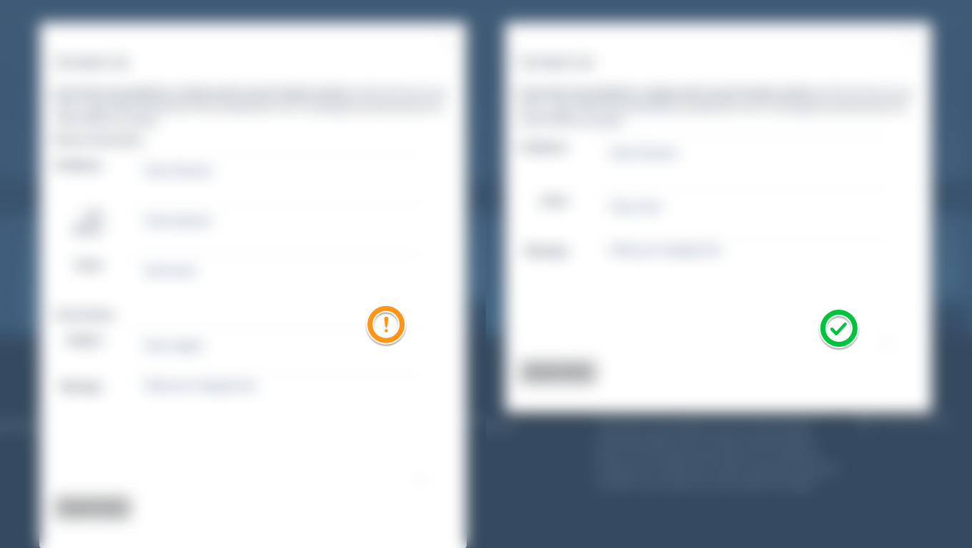
Naturally, the shorter form appears less daunting and will let the visitor make contact with your customer support team faster.
Sound human
You’re more likely to keep the customer engaged if your contact form sounds human. Let’s take an error for example, which of the following sounds more human-like and conversational?
“Error 431: field3 could not accept value”.
“Hmmm, that doesn’t seem to be a valid email address!”.
Visitors will be more willing to interact with a contact form if it “speaks” to them in a tone that they’ll resonate with. If the contact form communicates as if its actually having a conversation with the user, the user will communicate back.
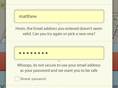
Image: Matthew Smith
If you can reduce user-error, even better. We can do this by making the form check for errors as the user is filling it out and indicating the errors clearly with bold visual styles.
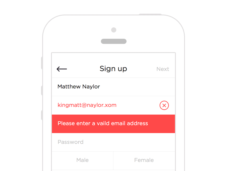
Image: Ben Dunn
Don’t swap labels for placeholders
Placeholders are the text that appears inside a form field, labels are the text that appears alongside the form field. Placeholders should show an example of an acceptable value, for example “@twitter” for a Twitter account, whereas the label should read “Twitter handle”. Why? Because users often forget what they were supposed to be typing, while they’re typing!
Placeholders disappear as soon as the user enters a value into the input field, so the field label needs to display the form field’s purpose (“Twitter handle” in this case) at all times.
Here’s an example of how it shouldn’t be done:
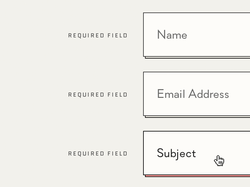
Image: Ines Gamler
Provide alternative ways to make contact
Website visitors also typically use the “contact us” webpage to find customer support numbers, addresses, social media handles and live chat widgets. Live chat widgets and customer service social media accounts are usually faster than contact forms, and a favorable method of contact for younger demographics.
Don’t lose out on customer conversions by offering a lack of options. Every user is different — every query is different — every user requires and expects a different response time.
Let’s take a look at our very own contact form at Kayako — notice how the alternative contact methods are clearly displayed in the sidebar and above-the-fold (i.e. immediately visible)?
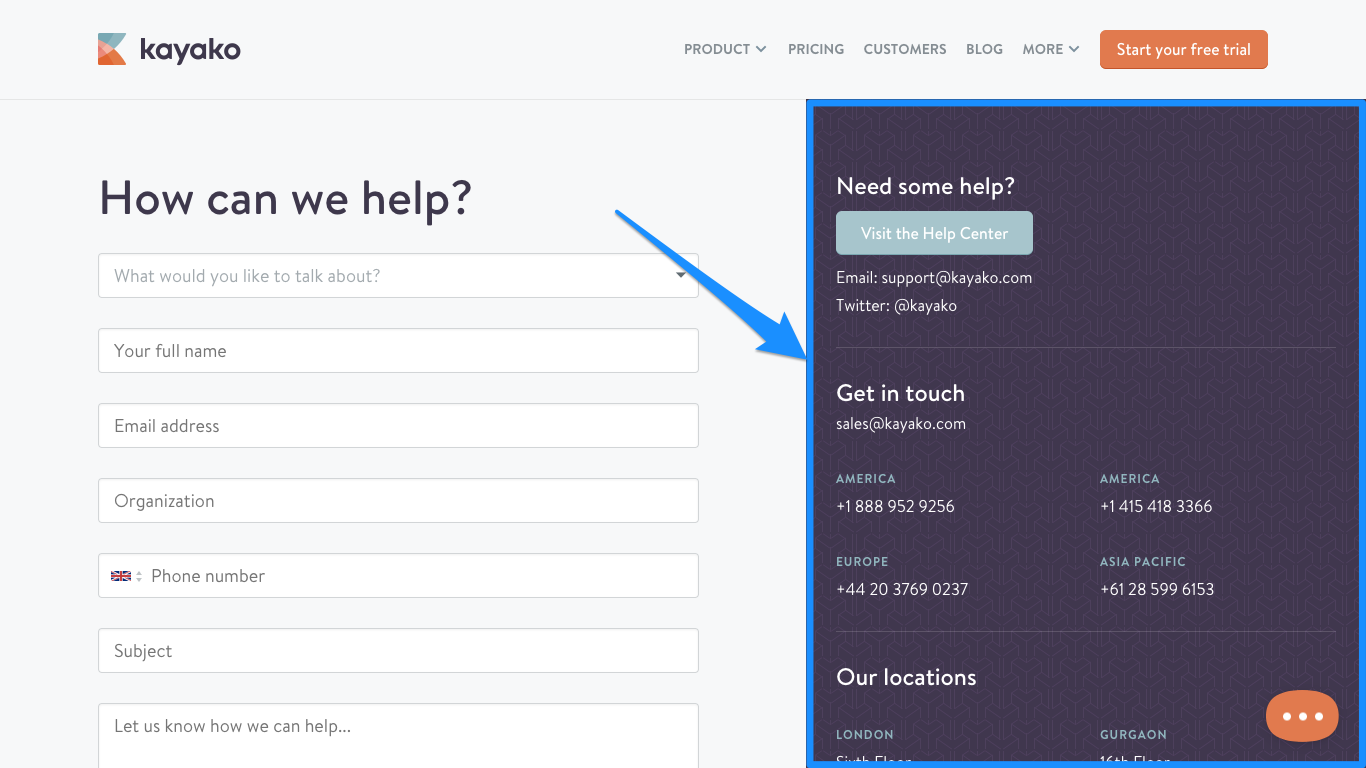
We’ve also been told that the human-like behaviour of the form is very inviting (do you see where it says: “What would you like to talk about?”). Also, our customer live chat widget shows the faces of our customer support team as well. Customers deserve more than automated robots; at Kayako we strive to help businesses deliver a better, more human customer experience.
Make average response times perfectly clear
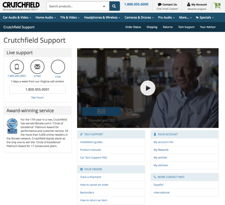
It’s hard to tell how large a company is by looking at their website. Sometimes a company may appear larger than it actually is, which makes the user think that there’s a huge customer service team working around the clock, when in actuality, there may only be one customer service representative working from 9am to 5pm.
Displaying average response times helps set expectations for when you might reply, otherwise the user may think you’ve ignored the message (and they may even send a second, more angrier email).
You can do this in two ways:
- Display the customer service operating hours (better for live chats)
- Or display average response times based on the current day/time (better for email chats)
Your contact form design is vital to customer experiences
Contact forms are a vital part of the customer journey, even in 2017. It’s the first method of contact that older demographics will use, and the preferred method of contact for younger demographics if it’s the first method they discover.
We can increase the likelihood of the customer following through with their query by eliminating unnecessary hurdles or redundant form fields, offering alternative ways to make contact, and communicating with the user in a conversational manner.
Overall, easier and shorter forms will result in more satisfied users, and ultimately, more users will convert to a customer.
[hs_action id=”8975″]