Customer feedback is important for any business that wants to better themselves. We can collect feedback on virtually any aspect of our business—our customer support, our website’s usability, the effectiveness of email campaigns, you name it.
But the problem is, unless you’re offering incentive for users to complete your customer feedback forms, such as discount coupons or free swag, users typically hate to give feedback (because…well…they’re boring and they’d much rather be doing something else entirely).
Well, unless they’re angry that is.
Let’s face it, we love to complain. How often do we ever complete online feedback forms to say something nice?
Usually, when we’re really, really impressed.
If we want the objective truth; if we want to know what users really think about our website, we need to be collecting feedback from all sorts of customers, not only those with something negative to say.
In order to help users complete customer feedback forms, we need to be offering two things, the first of which is optional but recommended:
- Incentives (free swag, coupons, et cetera)
- Fantastic user experience, so that forms can be filled out quickly
Ask the right feedback questions
Put on the spot, most users will freeze up when asked questions that they deem to be relatively vague, especially those that received what they would consider only an average experience.
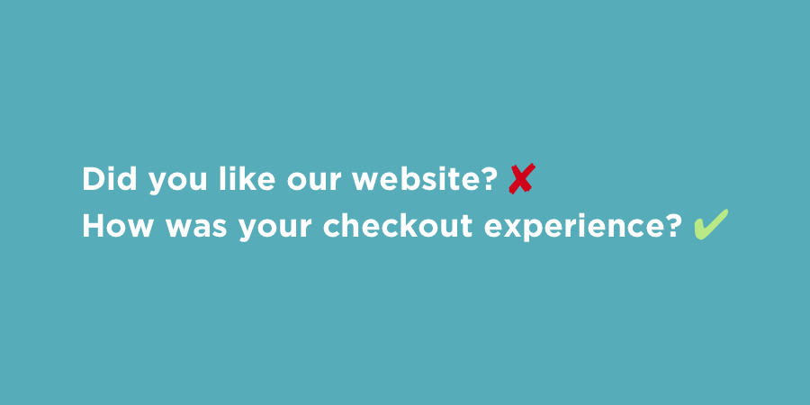
So that users customers don’t struggle to come up with things to say, it’s best to ask questions more specific than “Did you like our website?”, especially when we also want to find out what they liked or didn’t like, so that we can improve in that area. That being said, nobody likes a long, boring survey either, so it’s about finding the right balance and asking questions relevant to the experience that they had.
You can create more than one feedback form—you don’t need one singular feedback form to determine the effectiveness of your entire website, not when some users may only experience one aspect of it.
For example, when a user orders something from an e-commerce website, it becomes natural to ask them about the checkout experience. This will ensure that the questions are relevant to the user, and the form will be shorter and more focused.
Radio buttons vs. checkboxes
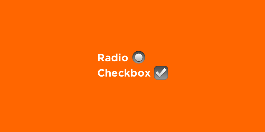
Ideally, you should be using radio buttons and checkboxes whenever you can.
- Radio buttons allow the user to choose only one option from a selection of options.
- Checkboxes allow the user to check all of the options that apply to them.
Both are types of multiple choice questions, and users generally enjoy these questions because they only have to choose from a list of options (they don’t have to think of something to say).
Multiple choice questions can benefit businesses as well, because the responses are measurable. Multiple choice responses can help your business make data-driven decisions, since the data from them is statistical.
Communicate with natural language
So we’ve established that specific, contextual questions are better, as they allow the user to complete the feedback form faster, but one thing that often throws users off is the lack of natural language.
When there’s too much formality or the questions are too vague, the user finds it hard to resonate with your tone of voice. That’s not to say that you should use slang, but you should “speak” to customers how you would speak to them in real life.
It’s also perfectly fine to use emojis, as they’re a terrific way to communicate emotion. Even though you’re communicating through a screen, behind those screens you’re both just two humans trying to have a conversation.

Don’t be intrusive
Where you insert your customer feedback form depends on the action the user is taking. Rolling back to the e-commerce example from earlier, you could include a link to your form on the checkout confirmation screen, or in the email receipt. Although, having a subtle feedback widget on the screen at all times helps the user offload their feedback whenever they want to (great for those users that don’t actually convert, since they can now tell you why).
But one method you should never approach? Popups.
Not only is this really intrusive and will seriously hinder the user experience, but the user can’t offer their feedback when they’ve only been on your website for 5 seconds.
As the Peak-End Rule states, users are more likely to remember how they felt at the peak of their experience and at the end of it.
Driving back to the e-commerce example again, the peak could be the shopping experience, and the end could be the checkout or email receipt experience.
A bad peak can outweigh an otherwise optimal experience, and a good peak can make up for an otherwise less-than-optimal experience.
In the future, users will judge your business based on those moments—these are the defining moments that decide if a user is to be a customer or a returning customer.
With that in mind, you’ll be wanting the user to fill out the customer feedback form when they’re “in the moment”, to ensure quality and reliable responses that reflect how users feel in those key, memorable moments.
Great apps for creating online feedback forms
Formstack is probably the oldest and most well-known app for creating online forms. If there’s a specific feature you’re looking for, Formstack has it, including the ability to auto-sync data from forms to other apps such as MailChimp, Google Sheets, PayPal or Salesforce (to name only a few).
Survey Monkey is another big-name choice, and sets itself apart by focusing on questions that help you to extract objective conclusions from responses.
Typeform is one of the newer kids on the block, offering not only a better form experience all round, but the ability to customize forms with your own branding and use conditional logic jumps to filter out questions that may not apply to certain users. It’s definitely one of the trendier options around.
Other online form apps worth considering
- Surveygizmo (features: skip logic and branding)
- Wufoo (now owned by SurveyMonkey, so there’s not much difference)
- Qualtrics (a slight focus on user research)
- Google Forms (awesome because: it’s free, integrates with Google Sheets)
3 fantastic feedback form examples
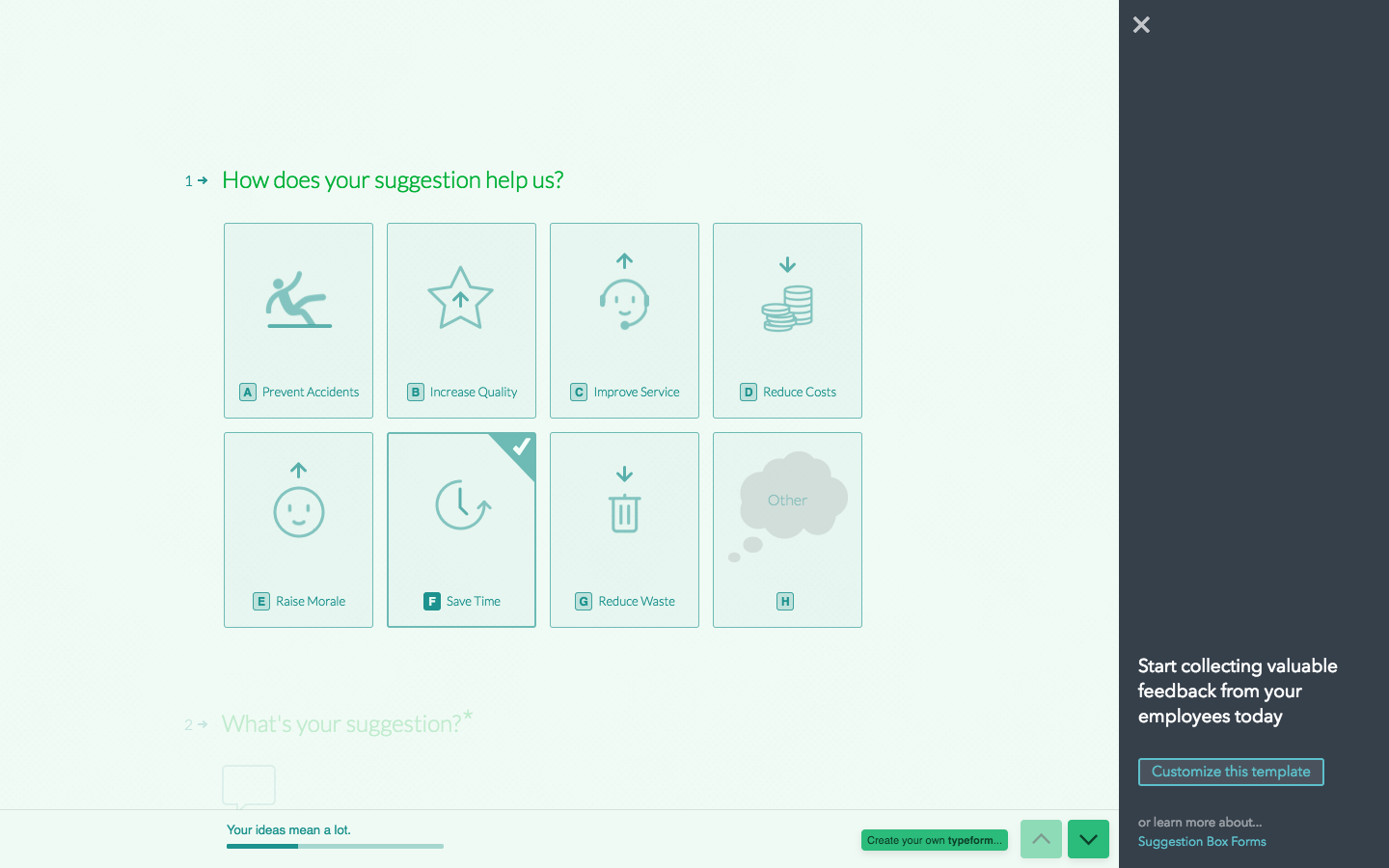
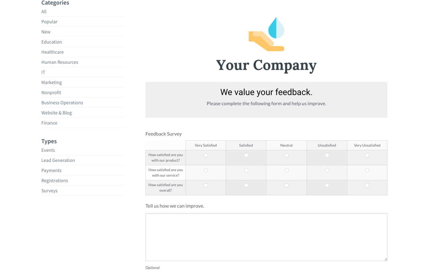
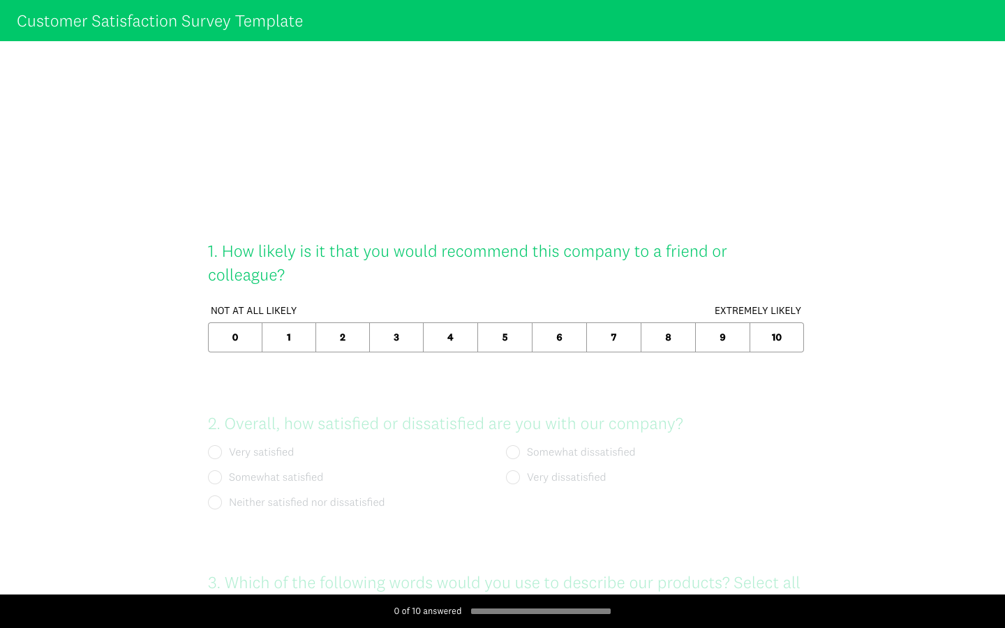
You’ll probably want to collect feedback using one of the apps mentioned above, so before we wrap this up, let’s take a look at some terrific examples of online feedback forms that don’t ruin customer experiences. You can actually play around with these and even submit them, so have a try!
Creating your customer feedback form: Some closing tips
Nobody knows more about your users, than your users. Great businesses listen to their customers in order to design better experiences for them. With that in mind, here’s some closing tips you should always remember:
- Show the user how much of the form they’ve completed
- Let the user navigate the form with the keyboard
- Set the tabbing order so the user can tab through the fields
- Break up long forms into multiple webpages so the user saves periodically
- Make use of whitespace so the form feels less cluttered
- Prioritize rating scales and multiple choice over long-form questions
- Most importantly: make sure that it’s mobile-friendly!
Many of the apps mentioned above will have these things covered!
[hs_action id=”9073″]


