Design standards are not top of mind for you as a customer support professional but they are critical to your customers’ experiences.
Your customer wants quick, easy answers to their simple questions. CEB, the insight and technology company that investigates customer loyalty best practices, reported that 67% of customers prefer self-service over talking to your team.
Customers expect easy and intuitive self-service:
- An earlier Forrester consumer survey about channel usage for customer service, reported that use of the help/FAQ pages on a company website for customer service increased from 67% in 2012 to 76% in 2014.
- One of the trends for this year showed that 90% of all consumers expect a brand or organization to offer a self-service support portal or frequently asked questions (FAQ) page.
It is clear that putting customer experience at the heart of your knowledge base or help center is critical in helping customers, lowering customer effort and reducing inbound support requests.
So how can we meet our customer’s self-service demands? By designing our help centers or knowledge bases with templates, themes, or layouts that are frictionless for the customer to navigate.
That means applying design standards to the architecture of your knowledge center.
But what is a standard, really?
To answer this we created a checklist of seven design standards used across some of the best help centers and knowledge bases on websites. Then we looked across the top 100 ecommerce sites to find out how standard these standards really are. Using guidelines from an earlier NN Group article, we use the following thresholds:
- Standard: 80% or more of websites use the same design approach
- Convention: 50 – 79% of websites use the same design approach
- Confusion: 49% or fewer websites conform, no single design approach dominates.
Note: The sites included in this research are the top ecommerce sites in the “Shopping” category on Alexa.
1. Well-placed search box/bar?
First, what is a well-placed search box or bar? It’s a prominent search bar on the homepage of your knowledge base (that reappears on every page) to prompt customers to type in their query.
Only 53% of websites have a well-placed search bar. This barely crosses the threshold of being a convention. Having a well-placed search box or bar, is considered a help center or knowledge base design best practice. It cannot be considered standard.
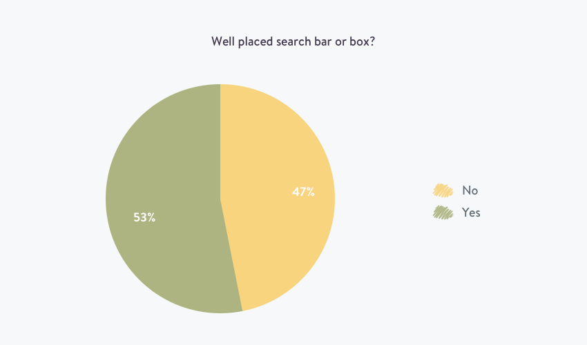
You want your knowledge base to be easily searchable, so your customers can find answers quickly. So we dug into the data a little more to see who was the worst offender between retail and SaaS/Tech companies.
- 68% of SaaS/Tech companies have a well-placed search bar
- Only 38% of top retail ecommerce site have a well placed search bar.
It appears that retail is the worst offender with a lot of confusion in their knowledge base architecture design. Although this placement is common and considered best practices, it cannot be considered standard for SaaS/Tech companies.
2. One click links to frequent questions/FAQ?
62% of help centers and knowledge bases have easy accessible links to their frequent questions or FAQs.
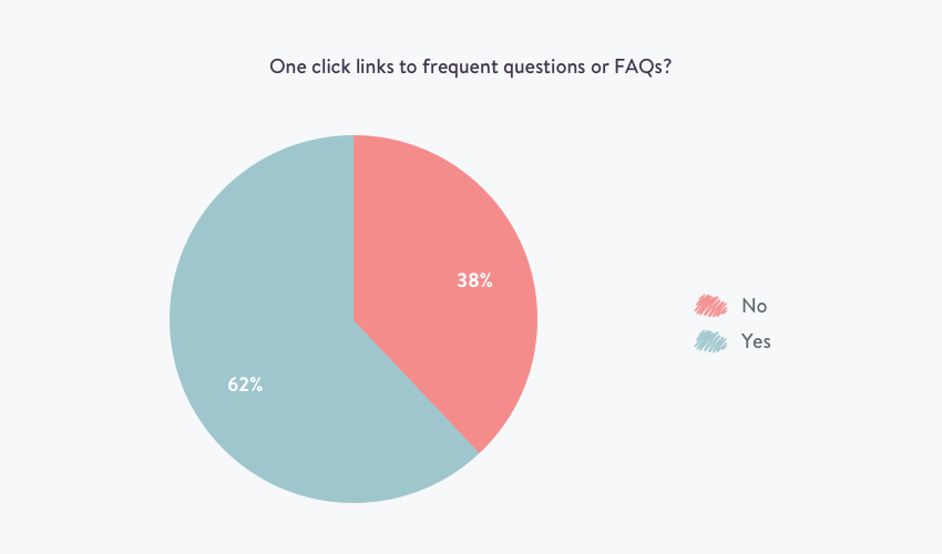
Since having FAQs on the homepage of your knowledge base seems like a given, it was time to find the worst offender:
- Only 54% of SaaS/Tech businesses have one click links to FAQs
- 70% of retail businesses have one clicks links to FAQs
3. Short titles with main keywords only?
94% of the help centers and knowledge bases had short titles for their self-service articles, making short titles with main keywords a help page design standard. Showing that the businesses analyzed care about giving their answers in the easiest possible format for their customers.
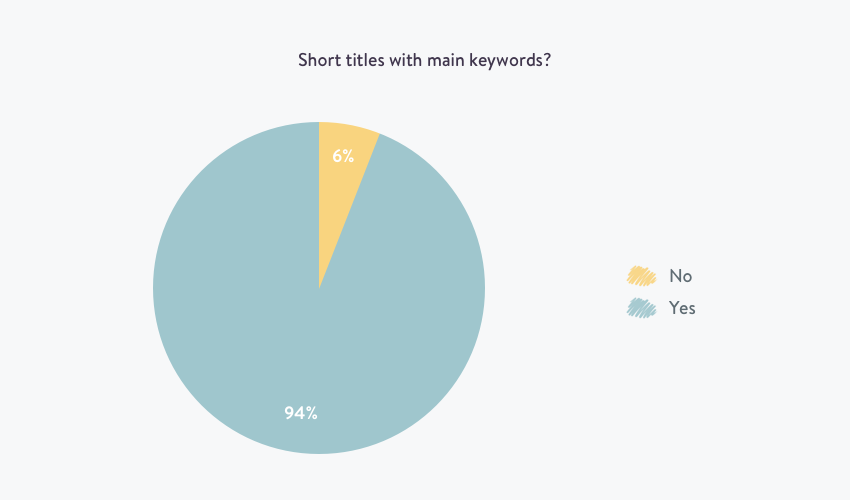
Since this was almost a complete standard, it was worth just having a quick look at the differences between retail and SaaS/tech
- 92% of SaaS/Tech businesses have short knowledge base article titles
- 96% of Retail businesses have short knowledge base article titles
4. Clear categories or topics?
83% of the help centers and knowledge bases had clear categories or topics that were either color-coded or categorized by need or motivation.
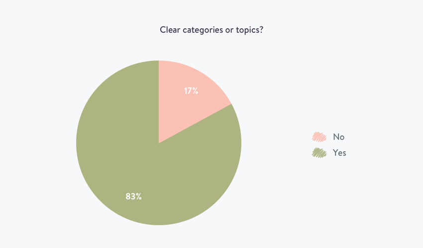
Since this was slightly over a standard it was worth seeing if one industry was out performing another.
- 86% of SaaS/Tech businesses are giving clear categories and topics for their readers
- 80% of retail businesses are giving clear categories and topics for their readers making this just on the level of a standard.
5. Is it easy to request further help?
82% of the help centers and knowledge bases had the option to request further help from support teams. We considered a “contact us” button, listing an email address, or having an icon for a live chat or messenger app as a way to request help.
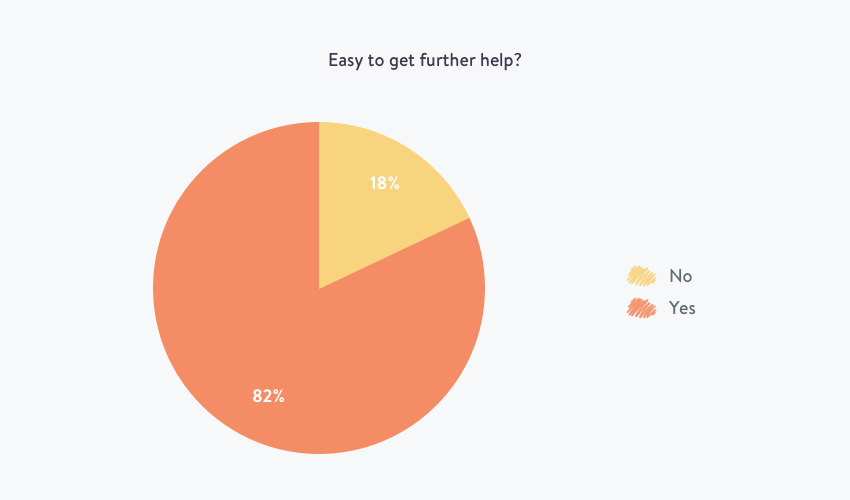
- 74% of SaaS/Tech businesses make it easy to request further help
- 90% of retail businesses make it easy to request further help
6. Good use of white space?
75% of help centers and knowledge bases had a good use of white space, making clear, easy and digestible content a convention and not a standard.
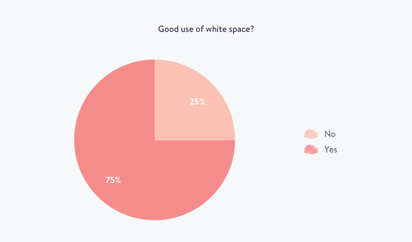
Deliberate use of white space is an excellent way to help the reader’s eye flow across the page.
It’s ideal in help center, knowledge base, and even website design — to break up long sections of text into paragraphs, use bullet points and headers. It is much easier to scan a well-presented article than a thick wall of text.
- 84% of SaaS/Tech businesses are using white space to help the readers eye
- Only 66% of Retail businesses are using white space in their formatting to help their readers eye
7. Option to translate into other languages?
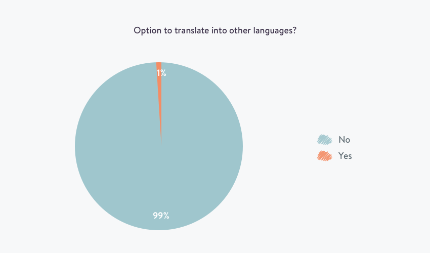
One of the most shocking stats in this research: Only 1% of the support pages analyzed had the option to translate the page into another language. Even then, this option translated the whole website and took you back to the homepage, rather than the help center or the page you were currently viewing.
- Only 2% of SaaS/Tech businesses had the ability to translate their support center language
- None of the retail support centers had the ability to translate into another language.
Digging into this deeper — and to be clear on our analysis — we were looking for an option on the page to translate only. We didn’t measure if the page translated with your IP address or location. Also worth considering is, with a site like Amazon.com, the option to translate the page is not available, but if you were a German national, you would be ordering from Amazon.de so the page would be in German.
Let’s review…
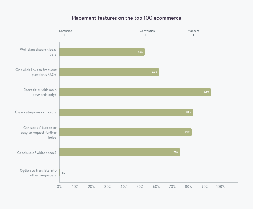
Not all design standards are standard after all. With three out of seven websites meeting what we thought were design standards.
While most brands might have different reasons for not including some of these design best practices, the most shocking element here is the 53% rate for well-placed search boxes or bars.
So it was worth splitting these business up into their respective industries and analysing the top 25 across retail, SaaS, and tech to really get some gritty detail on who has the best customer support website.
Which industries have the best customer support websites?
To recap on the smaller data points and look at which industry has the best support sites, we split SaaS, Tech, and retail up into groups of 25.
Editor’s note: In collecting the research I was surprised by how many big businesses, and big players in their respective industries that either didn’t have any sign of a support web page (we had to try around 150 sites to get the list to 100), or the help center was hard to find navigating from the main site.
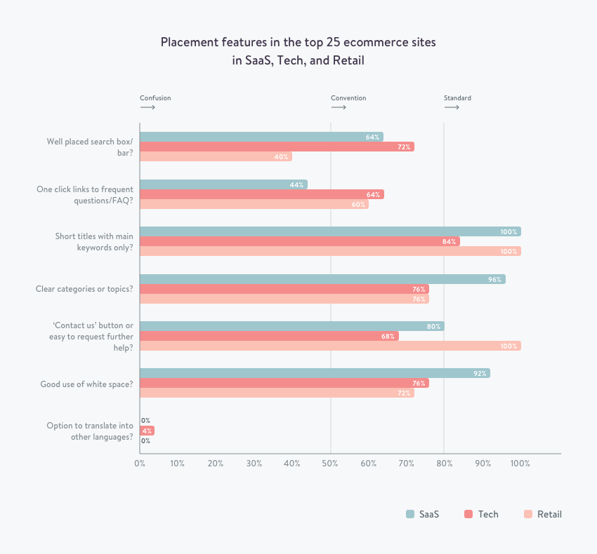
| Category of eCommerce | Number of Standards | Number of Conventions | Number of Confusions |
| SaaS | 4 | 1 | 2 |
| Tech | 1 | 5 | 1 |
| Retail | 2 | 3 | 2 |
There you have it. SaaS companies run away with the crown and showcase the best examples of knowledge bases.
Need Knowledge Base or Help Center software that can meet all these design standards? Try Kayako now, for a 14 day free trial.
How did we narrow down on a best design template?
The truth is, there’s nothing out there that we have found about the way to design your knowledge base or help center.
Although research shows that customers will often look to help themselves first, there is a lack of research about the best way of presenting this information to allow them to help themselves.
Further research is needed in the area of designing an effortless customer experience when a customer wants to help themselves.
How did we get this list of seven examples?
To assemble this list, we looked among the elements deemed essential to providing an effortless customer experience. We put ourselves in the customer’s shoes and asked: what would help the customer get their answer with the least amount of effort possible?
We then went on to identify brands with layouts and templates and compiled criteria based on what we thought were excellent examples of help centers. Some of those great examples of knowledge bases and help centers are by brands like YouTube, Netflix, Lynda, Wistia, Squarespace, MailChimp, and Facebook.
Structure, layout, and design of your self-service center matters
Whether you’re searching the web for a help center template, theme or layout. There are certain requirements you should take into consideration when building your self-service center to help your customers.
It’s hard to narrow down what this design checklist might include, but this research of the top 100 sites across the web should help you realize what design elements might need improving on your own site.
But we can all agree on the need to put yourself in your customer’s shoes, and try to empathize with them and the problem they’re trying to solve. Then, give them that information in the quickest most effective way, and always find a way for them to get in touch with you if further help is needed.

